
IEEEVis 2014 feels like months ago, but hopefully we’re not too late to add our favourite moments, ideas and soybots to the list. So here goes - in no particular order:
-
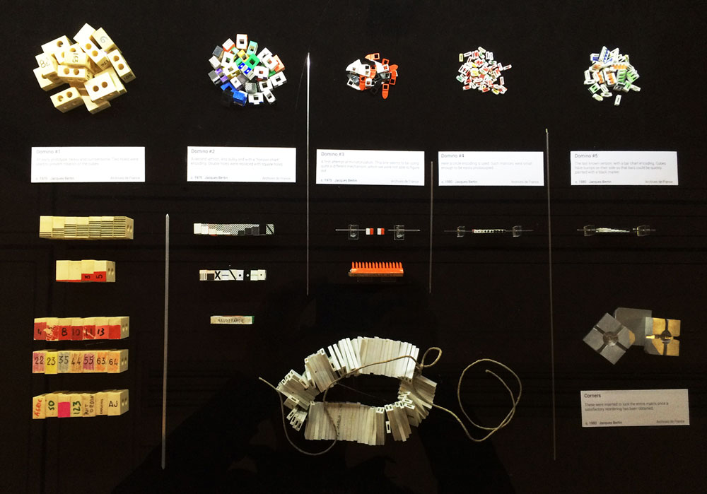
Bertin’s Exhibition: Looking at the influence the French cartographer Jacques Bertin had on the visualisation community, the exhibit included some fascinating displays of his work on reorderable and physical matrices. A nice reminder of the beauty of slow data in a world obsessed with big data.
-
Data with a cause - Visualization for policy change: What do the OECD, World Bank, and World Economic Forum have in common? A wealth of data and a massive challenge in presenting it in a meaningful way to a growing number of audiences. Reports are approaching their redundancy date, while spreadsheets are misleading by failing to accurately present the source and collection method behind the numbers. Most interesting though was the Q&A session where questions around the ethical considerations behind visualisations such as country ratings were raised, as well as the challenge of representing suppressed or ‘dark data’. An example of how the OECD are making their data more engaging was the OECD Better Life Index, which made an appearance in several talks throughout the week.
-
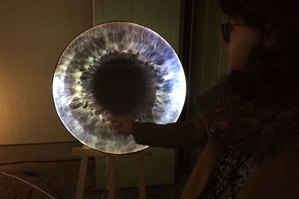
PhysicSpace: Looking at projects blending art and visualisations, the VIS Arts Program had some really interesting examples of initiatives in this space. One of these was PhysicSpace, a project where MA students from the RCA worked together with PhD students from Imperial College London to communicate quantum physics concepts through a series of objects and experiences. Although the resulting pieces are very engaging and beautiful, it was the genuine collaboration that took place between the artists and the physicists and the desire to reach a mutual understanding that resonated with us. You can have a look at all the projects here.
-
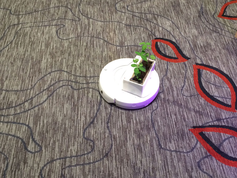
Soybots: While conference attendants were roaming the corridors of the Marriott in search for nurturing ideas and enlightening talks, Soybots - small robotic platforms fitted with potted soybean plants, were exploring the corridors in search for optimal light conditions for plant growth. A moving way of visualising the energy demands of a plant - whether this energy is natural or electrical.
-
Data for Good: Hackathons, open data and data science with an impact are still holding strong as conference buzzwords. A lot of the talks, especially their Q&A sessions, focused not just on the resulting visualisations, but on the nature of the data they were build on. Where did it come from? Who collected it? What impact will its visualisation have? Data for Good came up as an interesting example of a simple platform that lists socially beneficial data science projects. Their idea is to share ideas and encourage the replication of projects across communities.
-
‘Hipster stack’: Ironically, we went all the way from Shoreditch to Paris to find out there is such a thing called a ‘hipster stack’. Moritz Stefaner and Dominikus Baur ran a really interesting (and very busy) tutorial about how to make successful web-based visualisations. This included an in-depth description of a ‘hipster stack’, or the development tools they frequently use: SASS, Coffeescript, Grunt, Bower, Github. There were also a lot of helpful insights about using frameworks for deep-linking, improving graphic performance and javascript weirdness.
To wrap things up, here are our Top 3 ‘Overheard at IEEEVis 2014’:
- ‘If you torture the data enough, it will tell you anything.’
- ‘Good answers lead to more good questions.’
- ‘Focus on data driven questions, not data driven answers.’